
Assignment 6 for Data Science at Scale - Coursera
Incidents of Larceny/Theft are more frequent on Saturdays and in the North East Quadrant of San Fransisco.
This is to complete an assignment for my Data Science at Scale course. Because, this is a rather simple post for a grade and I’m short on time there isn’t a lot of analysis here. However, there are visuals in this post (finally) including a cool choropleth chart that I’ve been meaning to try out.
First I need to specifiy my packages and read the data into a data frame.
library(dplyr)
##
## Attaching package: 'dplyr'
## The following objects are masked from 'package:stats':
##
##     filter, lag
## The following objects are masked from 'package:base':
##
##     intersect, setdiff, setequal, union
library(readr)
library(ggplot2)
library(ggmap)

data<-readr::read_csv('~/datasci_course_materials/assignment6/sanfrancisco_incidents_summer_2014.csv')
## Parsed with column specification:
## cols(
##   IncidntNum = col_integer(),
##   Category = col_character(),
##   Descript = col_character(),
##   DayOfWeek = col_character(),
##   Date = col_character(),
##   Time = col_time(format = ""),
##   PdDistrict = col_character(),
##   Resolution = col_character(),
##   Address = col_character(),
##   X = col_double(),
##   Y = col_double(),
##   Location = col_character(),
##   PdId = col_double()
## )
data
## # A tibble: 28,993 x 13
##    IncidntNum                    Category
##         <int>                       <chr>
##  1  140734311                       ARSON
##  2  140736317                NON-CRIMINAL
##  3  146177923               LARCENY/THEFT
##  4  146177531               LARCENY/THEFT
##  5  140734220                NON-CRIMINAL
##  6  140734349               DRUG/NARCOTIC
##  7  140734349               DRUG/NARCOTIC
##  8  140734349 DRIVING UNDER THE INFLUENCE
##  9  140738147              OTHER OFFENSES
## 10  140734258                    TRESPASS
## # ... with 28,983 more rows, and 11 more variables: Descript <chr>,
## #   DayOfWeek <chr>, Date <chr>, Time <time>, PdDistrict <chr>,
## #   Resolution <chr>, Address <chr>, X <dbl>, Y <dbl>, Location <chr>,
## #   PdId <dbl>
This is a sample of the data in it’s raw form. Let’s find out the crime that has the highest number of incidents in this data set.
I take the whole Category column and seperate it out and turn it into a table. The R table function is a handy little piece of code that gives you frequency of each item in your input as a second column. The whole thing can then be turned into a data frame like I did here.
dataCrime<-table(data$Category)
dataCrime<-as.data.frame(dataCrime)
dataCrime
##                           Var1 Freq
## 1                        ARSON   63
## 2                      ASSAULT 2882
## 3                      BRIBERY    1
## 4                     BURGLARY    6
## 5           DISORDERLY CONDUCT   31
## 6  DRIVING UNDER THE INFLUENCE  100
## 7                DRUG/NARCOTIC 1345
## 8                  DRUNKENNESS  147
## 9                 EMBEZZLEMENT   10
## 10                   EXTORTION    7
## 11             FAMILY OFFENSES   10
## 12      FORGERY/COUNTERFEITING   18
## 13                       FRAUD  242
## 14                    GAMBLING    1
## 15                  KIDNAPPING  117
## 16               LARCENY/THEFT 9466
## 17                 LIQUOR LAWS   42
## 18                   LOITERING    3
## 19              MISSING PERSON 1266
## 20                NON-CRIMINAL 3023
## 21              OTHER OFFENSES 3567
## 22     PORNOGRAPHY/OBSCENE MAT    1
## 23                PROSTITUTION  112
## 24                     ROBBERY  308
## 25                     RUNAWAY   61
## 26             SECONDARY CODES  442
## 27             STOLEN PROPERTY    8
## 28                     SUICIDE   14
## 29              SUSPICIOUS OCC 1300
## 30                    TRESPASS  281
## 31                   VANDALISM   17
## 32               VEHICLE THEFT 1966
## 33                    WARRANTS 1782
## 34                 WEAPON LAWS  354
Then apply a geom_col treatment so that we can visualize the data. The categorical data will be the types of crime on the x axis and the quantitative data will be the number of times each crime occurs in the category column on the y axis. Easy! One thing to note I did have to limit myself to the top ten crime categories, or the table started to look terrible.
dataCrime<-head(dataCrime[ order(-dataCrime[,2], dataCrime[,1]), ], 10)

ggplot(dataCrime) +
  geom_col(mapping = aes(x = Var1, y = Freq), colour="blue") +
  labs(x = 'Type of Crime', y = 'Count of Each Crime',
       title = 'Frequency of Each Crime',
       caption = "2014 San Fransisco Crime Data") +
  theme(legend.position="none", axis.text.x = element_text(angle = 90, hjust = 1))
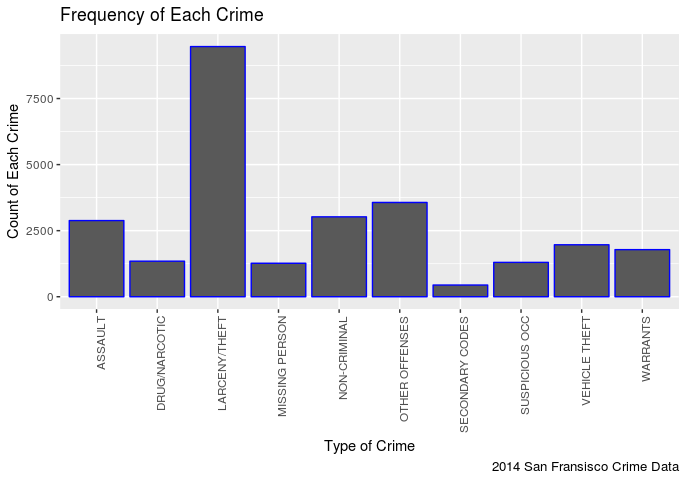 In my opinion this is pretty predictable, it seems there are more incidents of Larceny/Theft then any other crime.
Let’s find out the day of week one is most likely to be stolen from.
I need to filter the Category variable for ‘LARCENY/THEFT’, take only the day of week column and turn it into a table just like last time.
dataLT<-dplyr::filter(data, Category=='LARCENY/THEFT')
dataLT<-table(dataLT$DayOfWeek)
dataLT<-as.data.frame(dataLT)
dataLT<-dataLT[ order(-dataLT[,2], dataLT[,1]), ]
Then I will turn that into a simple column chart with the nominal data (days of week) as the x axis and the quantititave data (frequency of each day of the week) as the y axis.
ggplot(dataLT) +
  geom_col(mapping = aes(x = Var1, y = Freq, fill="red"), colour="red") +
  labs(x = 'Day of Week', y = 'Frequency of Larcneny/Theft',
       title = 'Larceny/Theft on Day of Week',
       caption = "2014 San Fransisco Crime Data") +
  theme(legend.position="none")
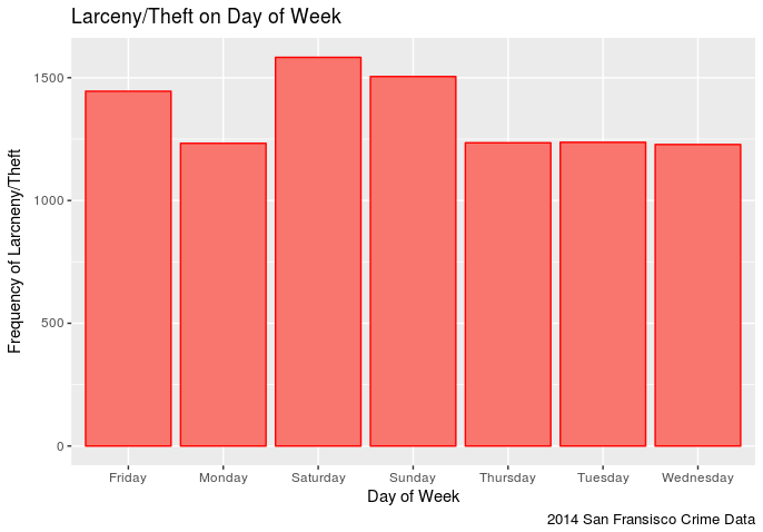 It appears that one has a slightly higher chance of being stolen from on a Saturday in San Fransisco (in 2014) than any other day. Though Sunday comes close followed by Friday. This makes sense in that the weekend seems to be the time when more assualts occur. It is also interesting to note that Larceny/Theft occurances on Monday-Thursday remain pretty steady.
Let’s see if we can find out the places in San Fransisco to avoid on Saturdays.
dataLTMap<-dplyr::filter(data, Category=='LARCENY/THEFT')
dataLTMap<-dataLTMap[,c(10,11)]

map <- get_map(location = 'San Fransisco', zoom = 12)
## Map from URL : http://maps.googleapis.com/maps/api/staticmap?center=San+Fransisco&zoom=12&size=640x640&scale=2&maptype=terrain&language=en-EN&sensor=false
## Information from URL : http://maps.googleapis.com/maps/api/geocode/json?address=San%20Fransisco&sensor=false
mapPoints <- ggmap(map) +
  geom_point(data = dataLTMap, aes(x = dataLTMap$X, y = dataLTMap$Y, fill = "red", alpha = 0.4), size = .5, shape = 21) +
  guides(fill=FALSE, alpha=FALSE, size=FALSE)

mapPoints
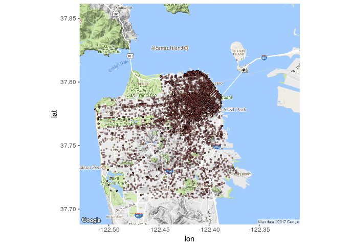 It seems that most of the reported thefts (in 2014) occured in that north east quadrant. To bad my data set doesn’t tell me what was stolen, it would be interesting to see how many of those were bike thefts (I dig bikes).